Brief History
In 1842, astronomer John Herschel sought a cost-effective, efficient means of copying and reproducing his notes and diagrams. Herschel successfully developed an iron-based, UV light sensitive emulsion and in doing so, discovered cyanotypes (referred to as blueprints at the time). However, it was not until the late 1840’s that cyanotypes were utilized artistically. Botanist Anna Atkins is credited with creating the first photographically illustrated book and ultimately popularizing cyanotypes within the artistic community. New technology eventually made this process obsolete, however, artists to this day still resort back to cyanotypes to cultivate the traditional aesthetic that they convey.
Understanding Negatives
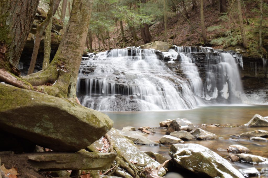
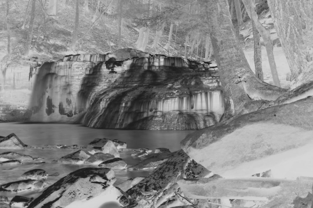
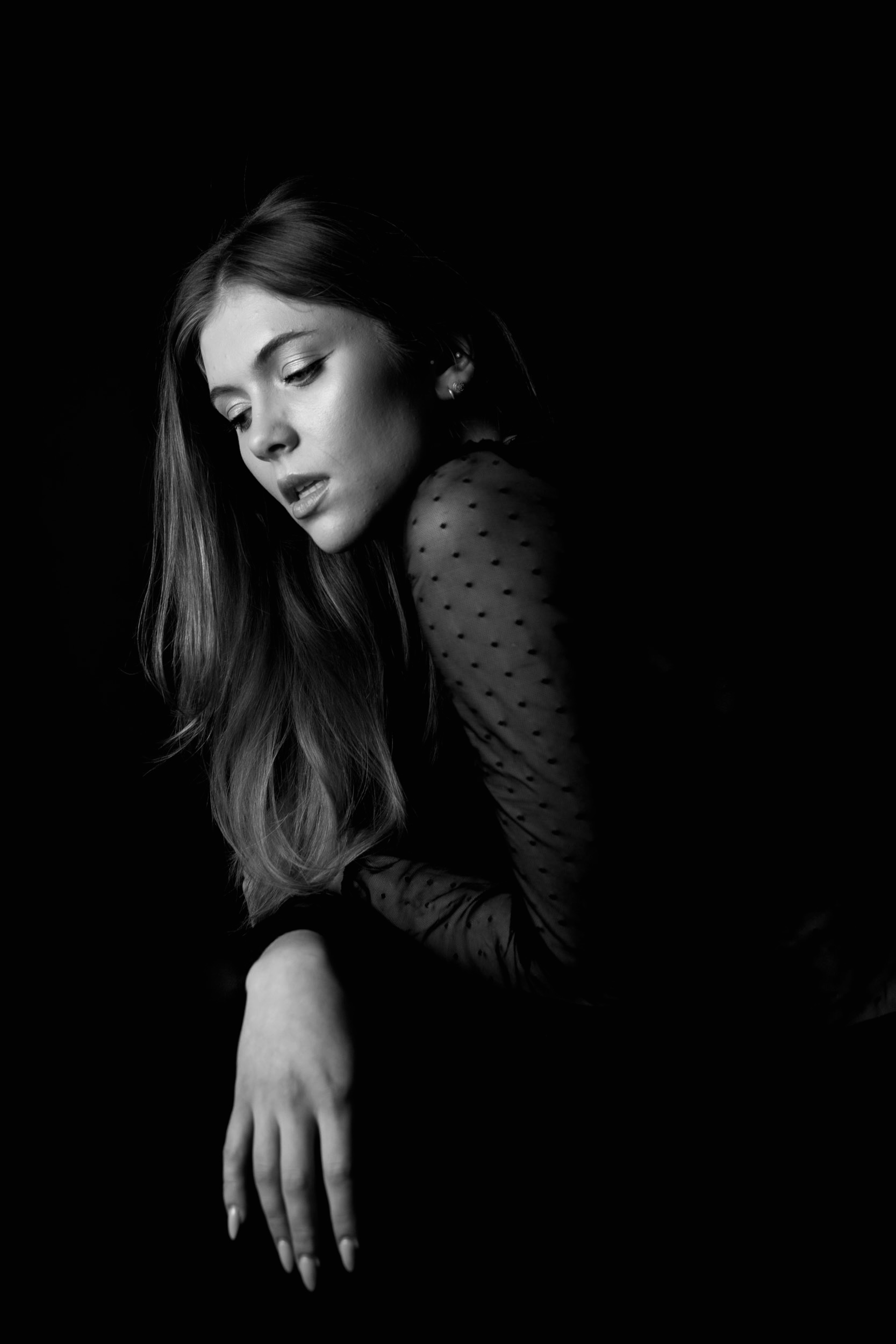
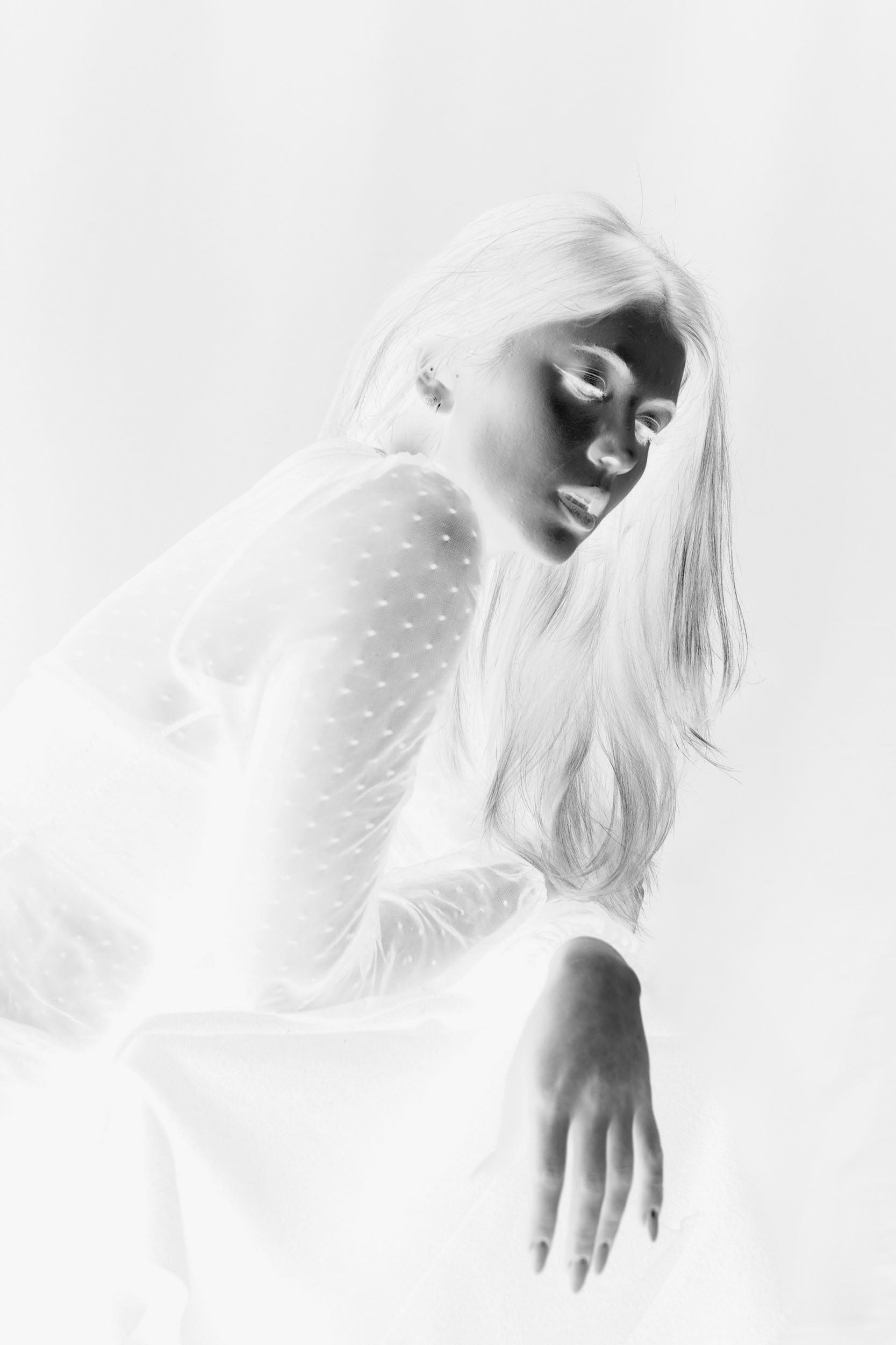
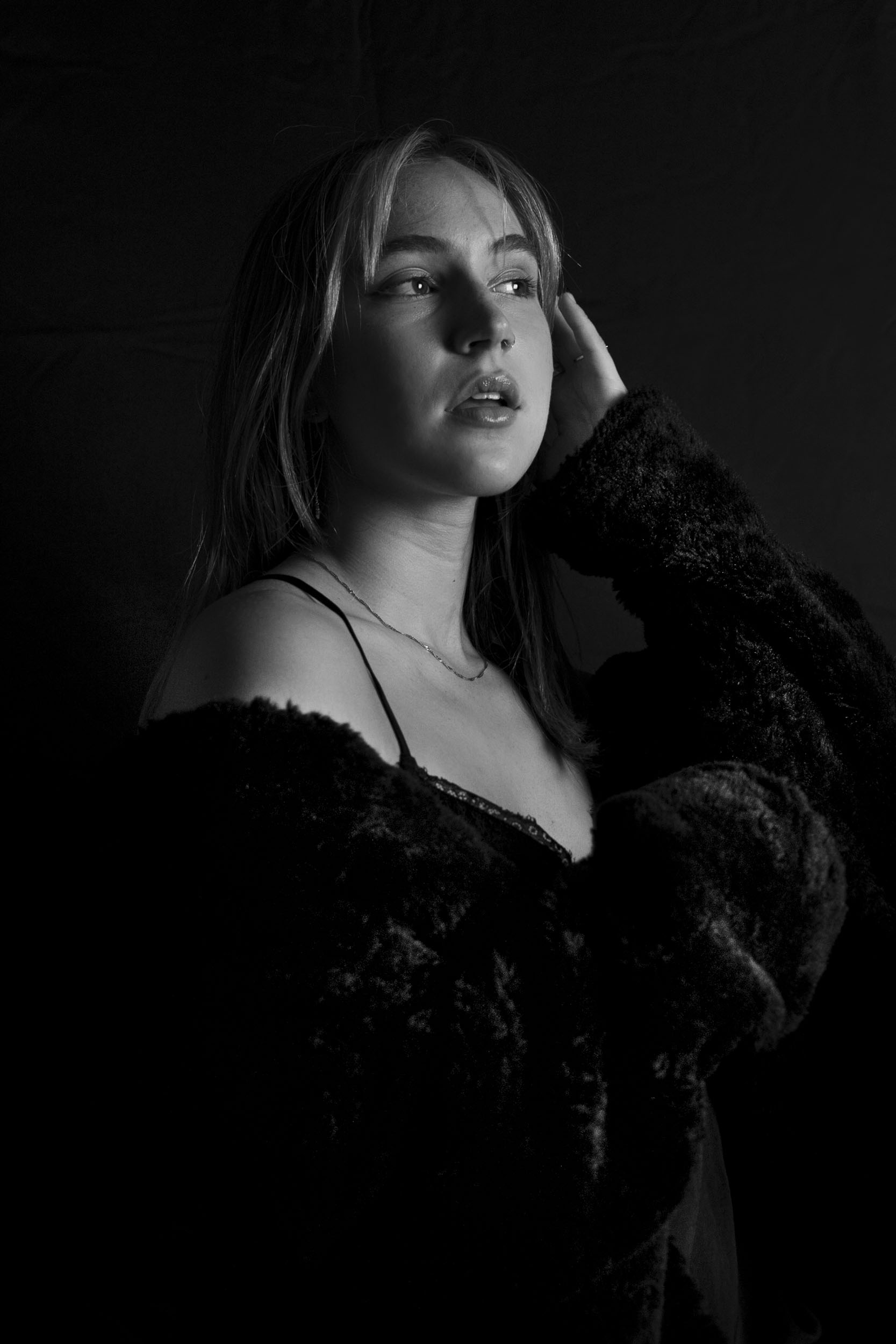
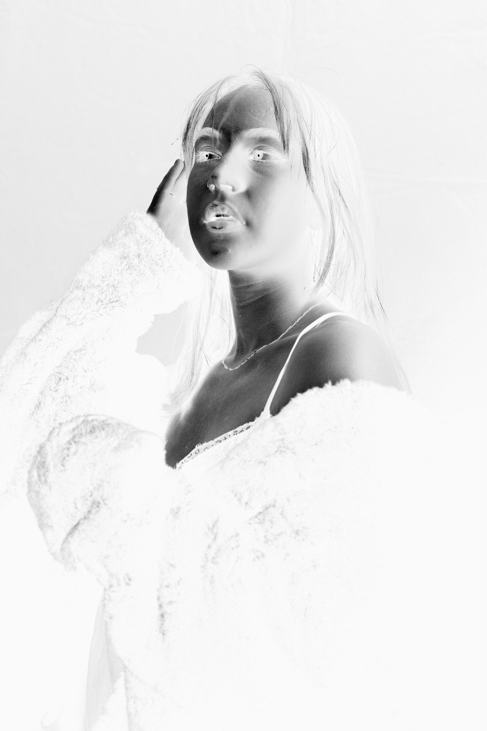
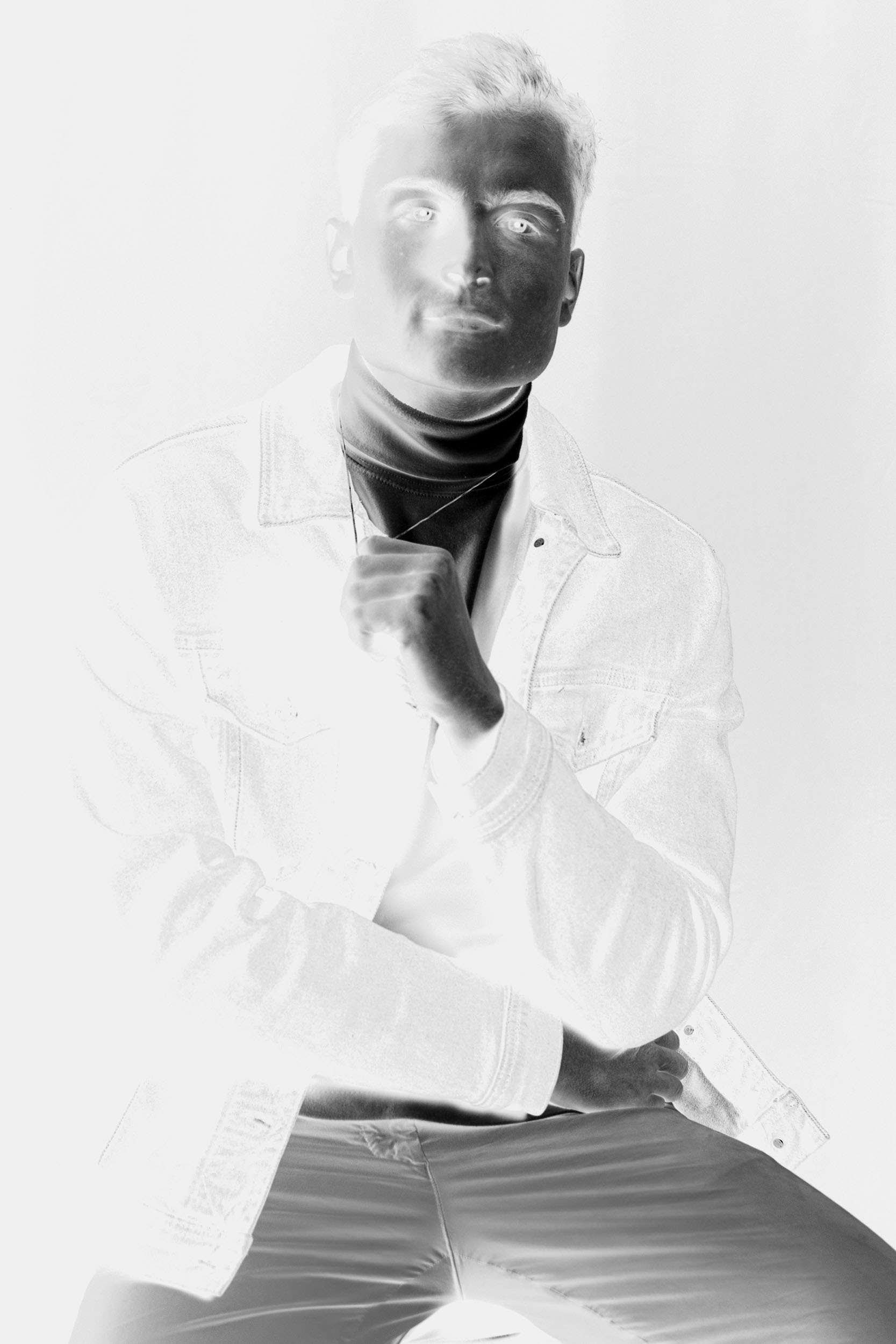
Creating cyanotypes first requires a negative. A negative is an image with inverted colors and therefore, darker values in the negative actually represent brighter values from the original image and vice versa. Negatives are naturally produced by film cameras, although DSLR and mirrorless cameras require producing a digital negative. To create a digital negative, I manually converted the original image to b&w, inverted the colors, and flipped the image horizontally to appear backwards as shown in the second b&w photo. I then printed the image on Pictorico transparent paper.

Developing Cyanotypes
After creating the negative, I began to prepare my cyanotype emulsion. A variety of different pre-made emulsions exist, although I used a chemistry kit composed of primarily ferric ammonium citrate, potassium ferricyanide, and potassium dichromate, all of which create a yellow/green emulsion. I carefully applied the emulsion with a brush onto a cold-pressed watercolor paper in a dark room in order to prevent any UV exposure. I then let the emulsion dry completely, and then placed the digital negative print side down on the dry emulsion.
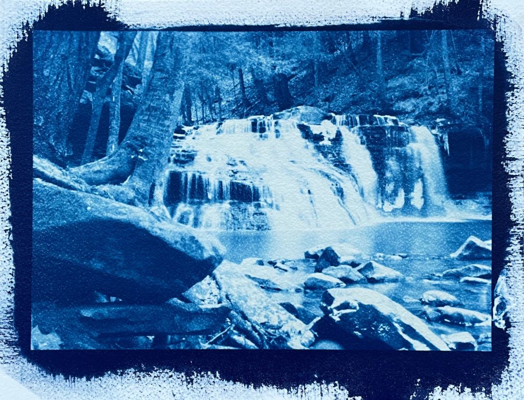
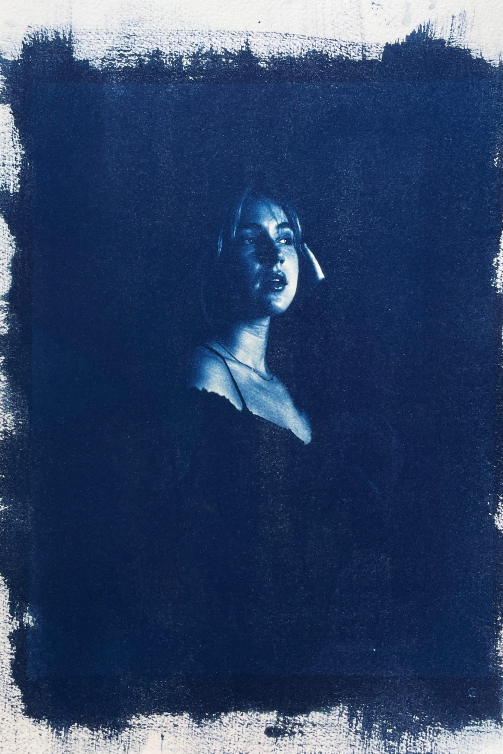
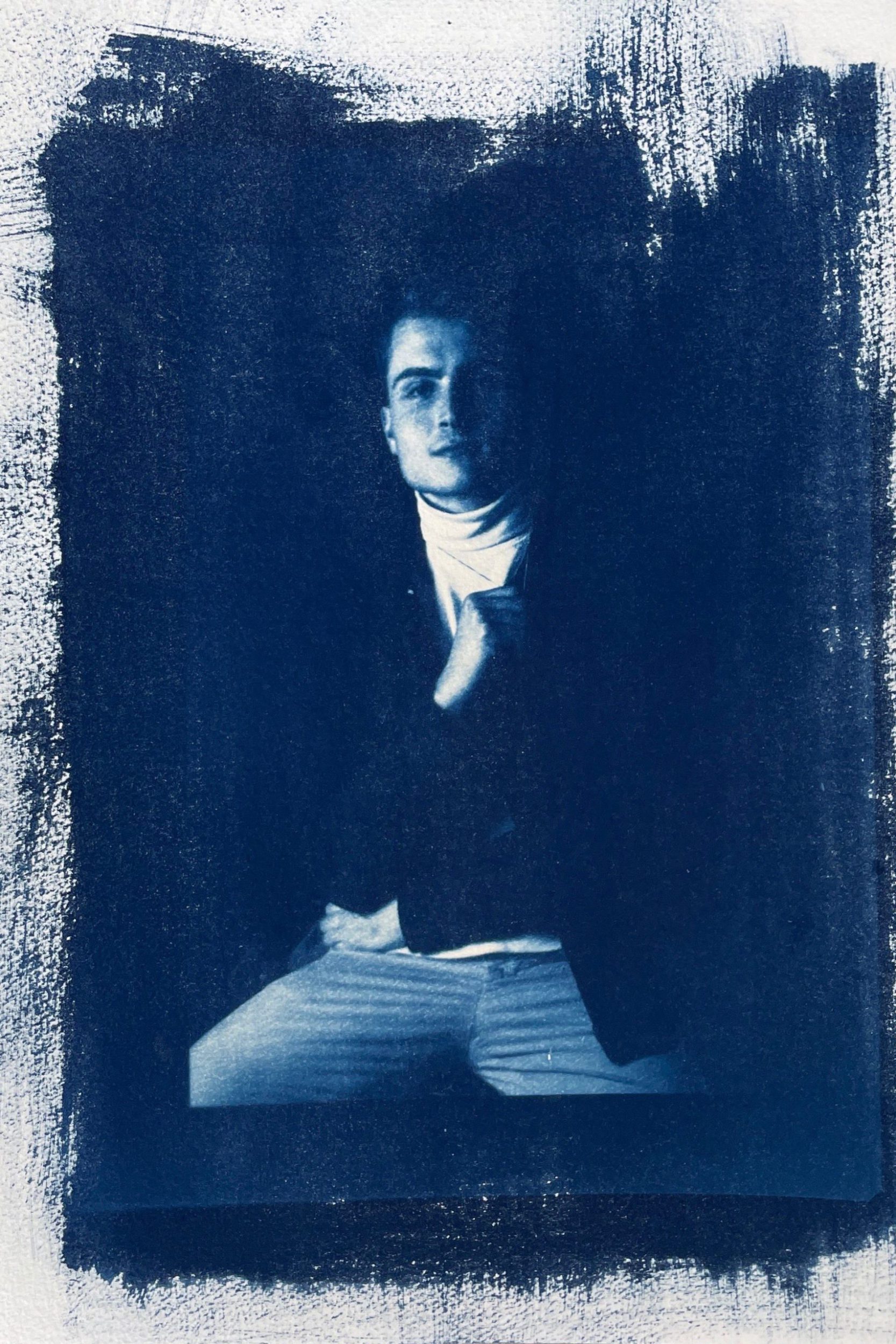
I then exposed the overlapping negative and watercolor paper in UV light for 6 minutes. The imprint on the watercolor paper from the negative (inverted and backwards) will create an identical, royal blue replica of the original image as displayed on the left. I immediately rinsed the excess emulsion off of the watercolor paper to stop the exposure, and oxidized it with hydrogen peroxide to bring out the highlights. All that is left is allowing the cyanotype to hang dry. After experimenting with this waterfall image, I determined the optimal quantity of solution, exposure time, and type of watercolor paper, all of which can drastically impact the cyanotype’s final result. I then used these findings to contrast the traditional, unique aesthetic that cyanotypes convey with modern studio portraits.
Analysis
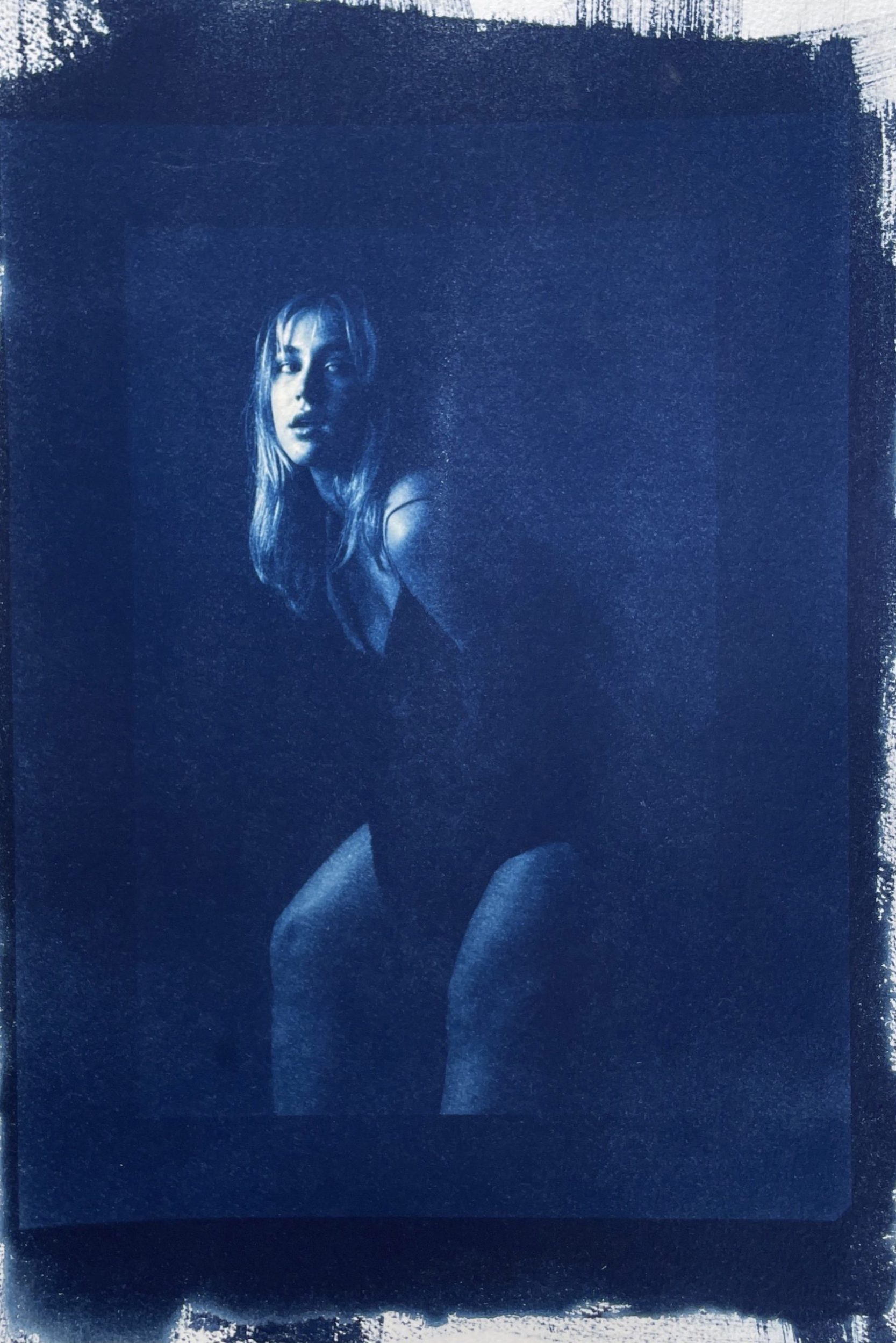
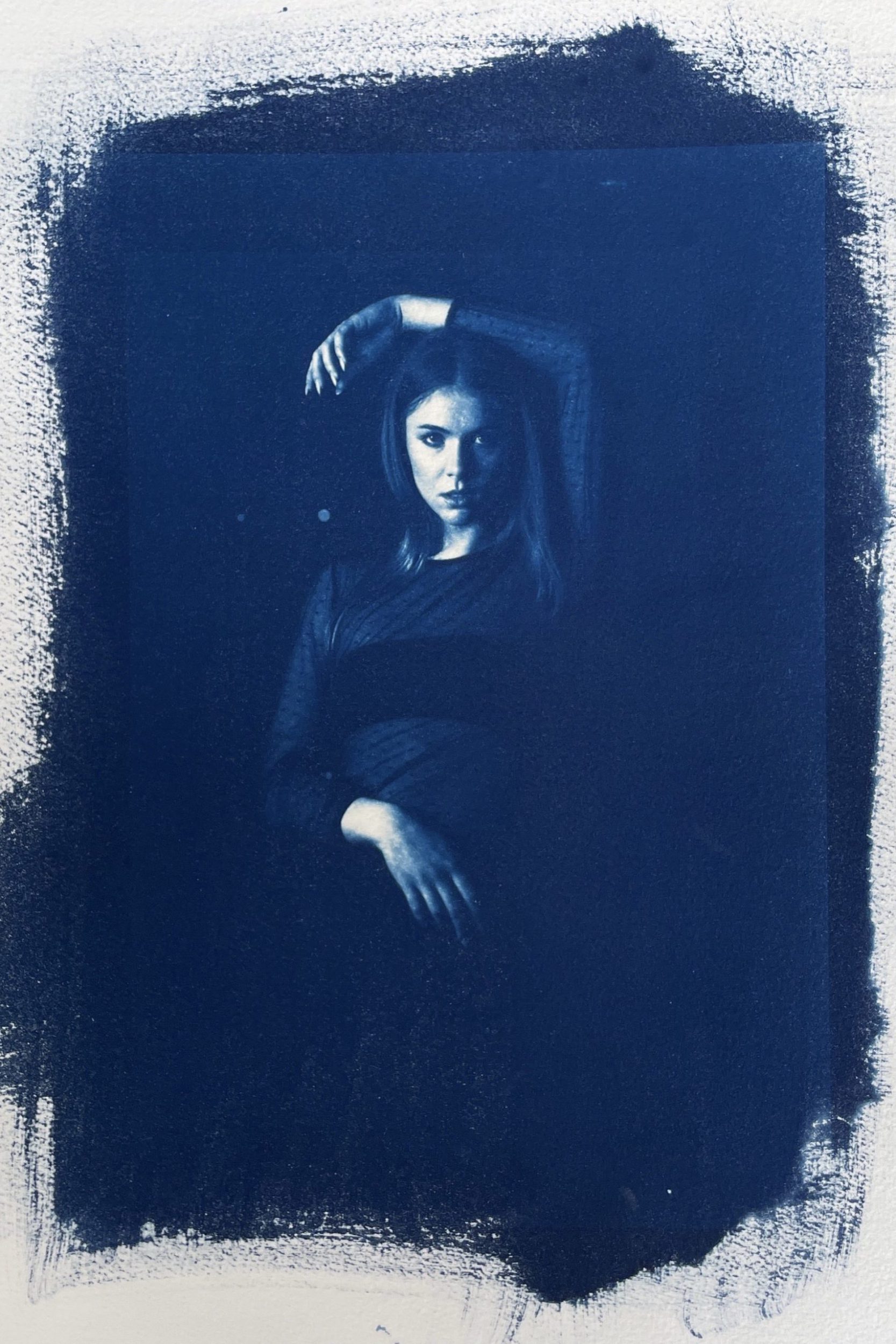
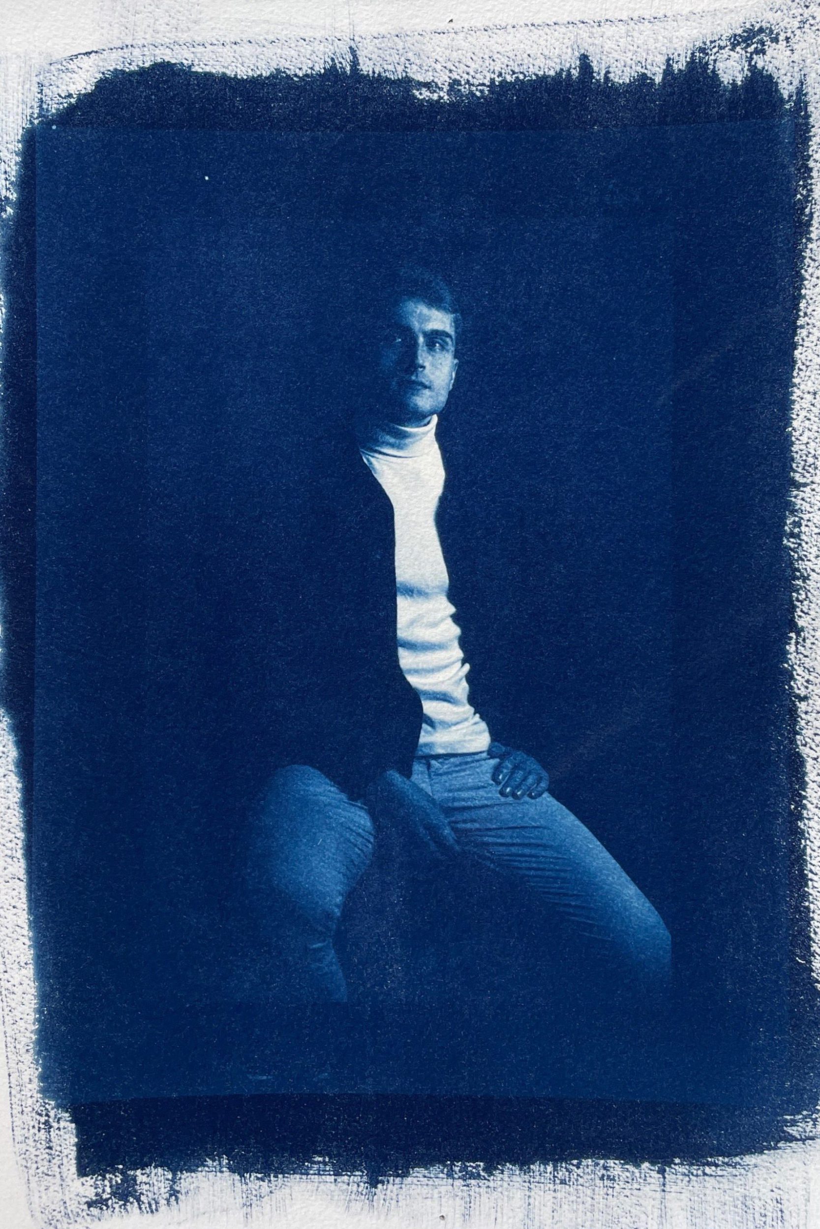
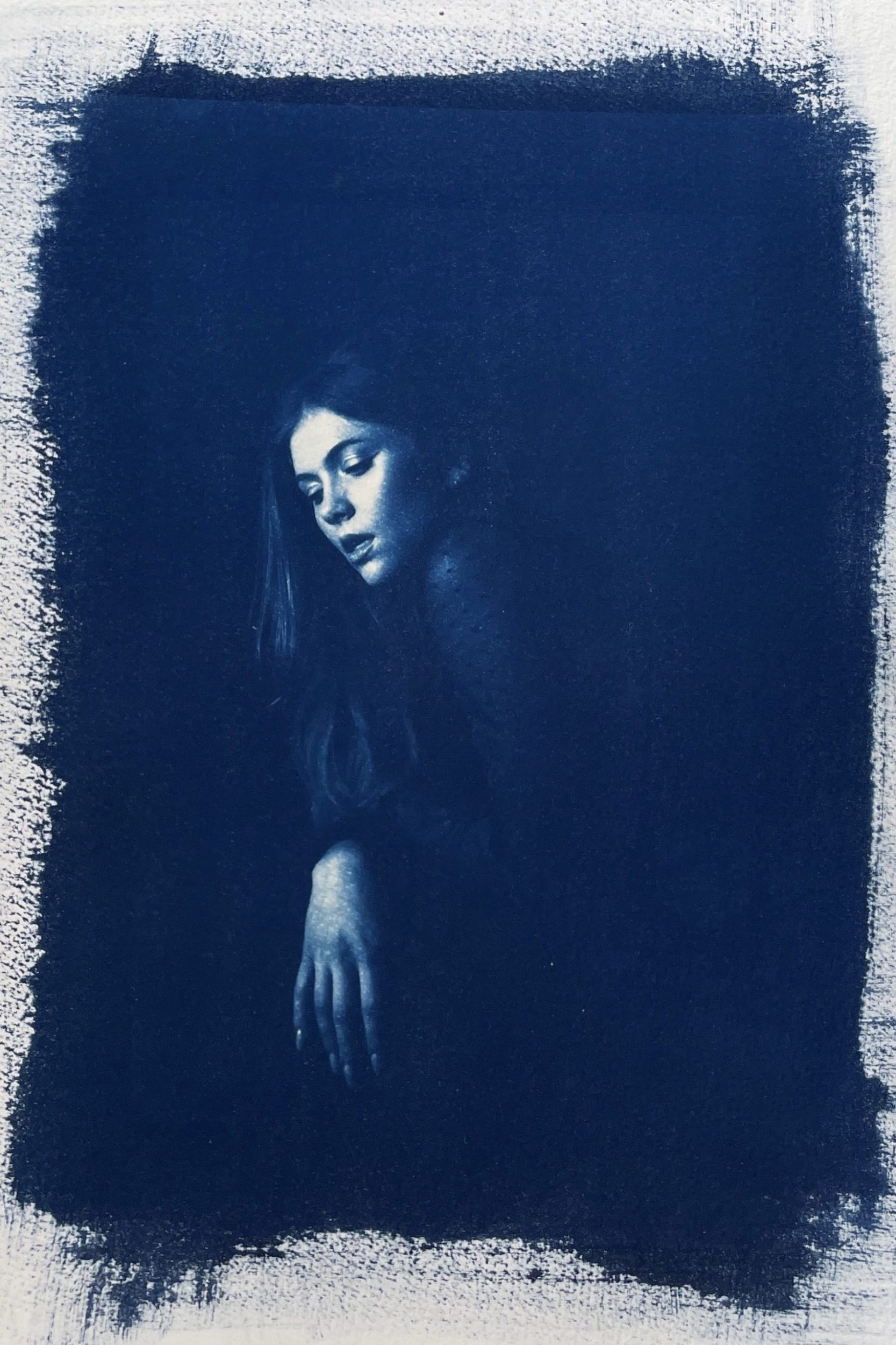
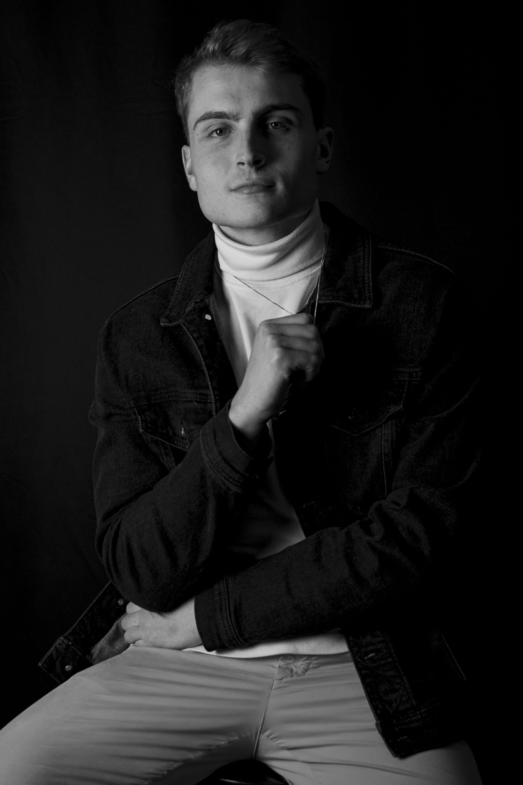
The series of images below display the original portrait, digital negative, and corresponding cyanotype. I thoroughly enjoyed the combination of strategic experimentation and impromptu development with unique, varying results. I also enjoyed working in a dark room environment to create a physical piece rather than merely editing and sharing the image digitally.
I ultimately aimed to develop modern studio portraiture using an antiquated process to evaluate the relationship among the two entities representing different eras. Despite clashing the two, the prominent brush strokes in the cyanotypes compliment the dramatic tone and aesthetic of the portraits. I also value the apparent confusion that juxtaposing the two styles creates for a viewer with no context, and encourage you as a viewer, to find a relationship among the subjects yourself.
Conclusion
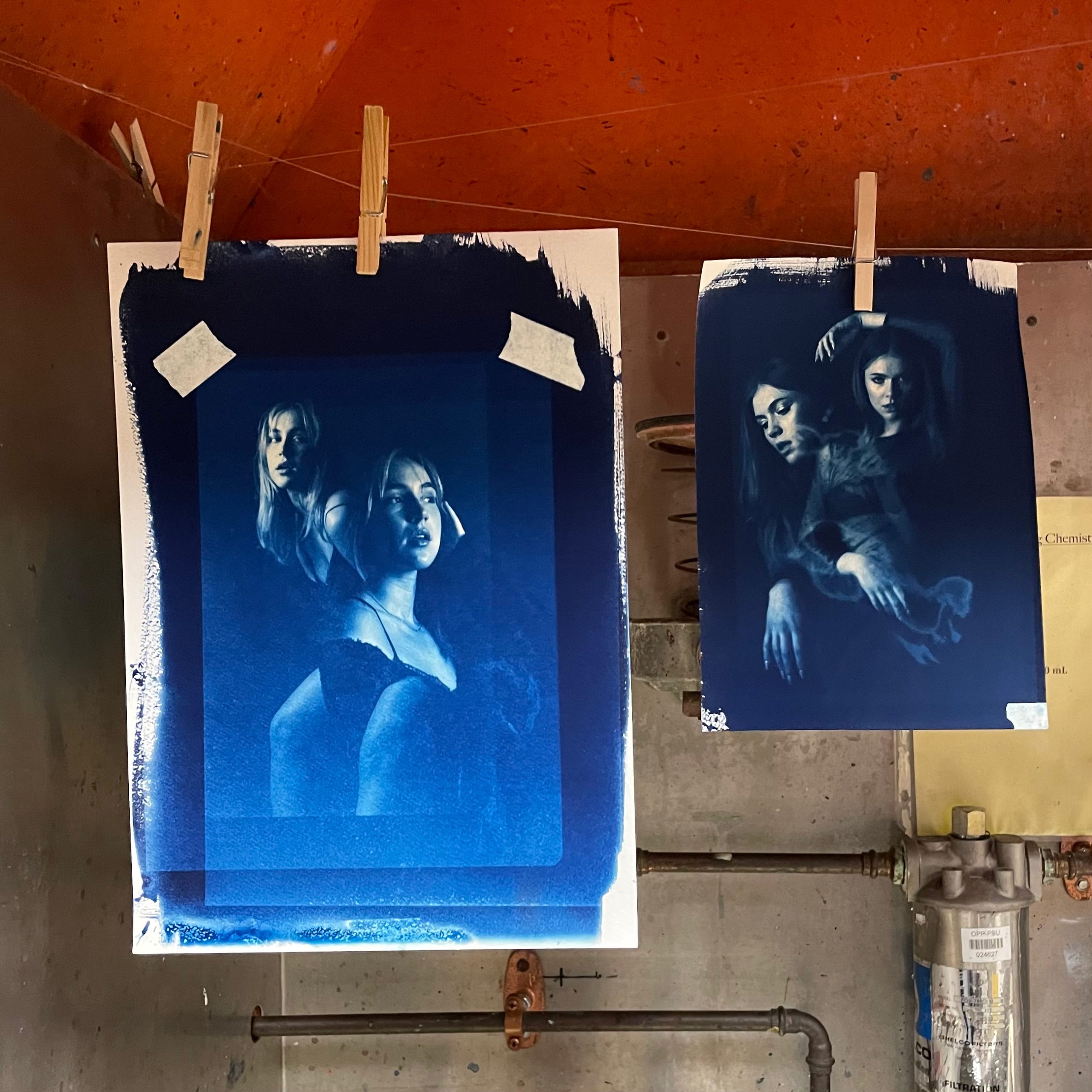
After completing this rewarding, although tedious process, I gained a newfound appreciation for cyanotypes that actually inspired me to explore other traditional photo development methods. I also experimented with using two overlapping negatives to create double exposures as displayed on the left. Ultimately, I aimed to intersect an old, timeless technique with a modern style to consider the evolution of technology, and pay tribute to a cyanotype’s contributions to modern photography.
